Tutorial/Workflow using Gimp
This tutorial is what I consider to be a "quick and dirty" method of creating a enjoyable piece of artwork. My more complex digital paintings involve much more detail work and patience, but this is a fun way to do something if you just want to get an idea down.
This tutorial is also intended to show how the Gimp does things. Why the Gimp? Because it's free. And most digital artists who create tutorials are using something that costs money, which many newcomers don't want to invest in yet (no sense paying huge amounts of money if you don't even know if you like digital art yet!). So I thought that it would be useful of me to do this tutorial with Gimp. There is no way I can show you everything there is to know about Gimp, though, so to some degree you'll need to be brave and try different tools out and read manuals. If you already know some other graphics program, you'll already know quite a few things. But there are a few key differences in Gimp, so be prepared to look for things in unexpected places.
What you should already know
This tutorial assumes that you already know how to:
- use a computer and understand basic concepts like clicking, dragging, and opening files
- draw something you consider worthy of coloring. It also assumes that you have some rudimentary understanding of where you put the shadows. That said, if you don't know where to put the shadows, then you can use this tutorial up through step 5 to just learn how to use the Gimp. Static coloring is, after all, a viable choice in many cases. I just personally like to get more involved than that, so this tutorial shows that stuff as well.
- scan drawing
This tutorial can be followed with either a tablet or a mouse. It will, however, go much slower if you only use a mouse.
Sketch
Nothing new here, really. You have to know your anatomy, your perspective, your "wtf is a logical thing for a character to do". The reason I do this stage in pencil and not digitally is that I personally do find it easier to "feel" an image when I can connect directly with the paper, rather than a mouse/stylus.
Incidentally, this tutorial works with an inked drawing as well as with a pencil drawing.
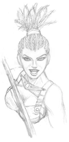
Scan and prep
Yes yes, big surprise. But do be sure to scan it in big. I personally scan at 600 dpi because I'm an extremist.
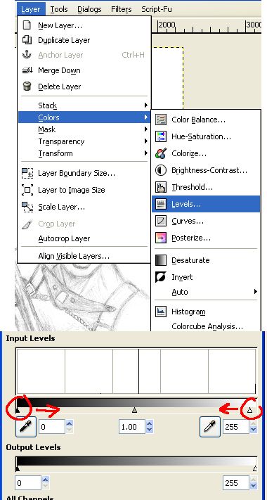
After scanning, I usually tweak the levels (see image) a smidgen to reduce the most banal of messiness. Just enough to make the blank space look cleaner
Tools
Ok, backing up a bit, since this tutorial is also for people relatively new to digital art, I'm going to go over some basics of the software. If you already know this stuff, feel free to skim over the boxes.Layers
Layers are a great way to isolate aspects of your drawings. Some people love to use oodles of them, some like to have as few as possible. The more layers you have, the more memory your computer needs, so don't use more than you need to.
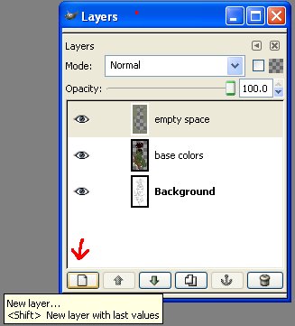
To create a new layer, click the icon at the bottom of the layer dialog (see diagram). In this tutorial we do not use the opacity slider, but we do use the Mode option, and that little check box next to the mode field. That check box preserves transparency.
Color Picker
The color picker is in the toolbar that is always open, so you don't need to hunt for it. To change colors, left-click on the top-left square of color.
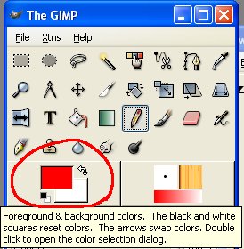
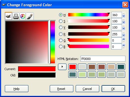
That will open the color picker dialog with has all sorts of options. I recommend just playing around with the tabs and sliders and various doohickies to see the various ways you can schoose colors.
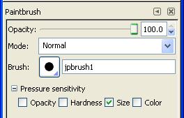
Brushes
The brush tool is selected from the toolbar using this icon:

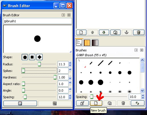
The Gimp has a number of preset brushes, but unfortunately I have not figured out how to resize them! So instead I created a new brush that I named "jpbrush1" (see image). It's just a very simple round brush with hard edges (that would be the Hardness slider). I use this brush the entire time, and just keep the Brush Editor window open so I can adjust the size of it (that is the Radius slider).
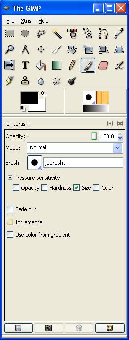
In addition to the side of a brush, I also change the opacity of the brush throughout this example. A low opacity means I can put down colors slowly and gradually. The opacity setting is available under the toolbar when the brush tool is active (see image).
Allow me a momentary rant here to say do not use soft edged brushes! This is a frequent "mistake" (I use quotes, because in art, all things are subjective) that new digital artists make. Soft edged brushes have their place, absolutely, but used exclusively they produce fuzzy, lifeless pictures. If you want soft transitions, use a hard edged brush with low opacity and build up the colors. Once you get used to that, you start to get a feel for when to safely use soft-edged brushes.
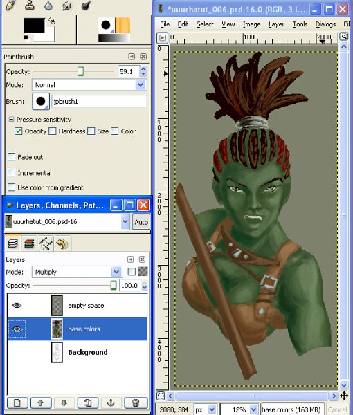
Base Colors
Ok, here we go. We've got our basic round brush, we have our sketch, now all we need is the colors.
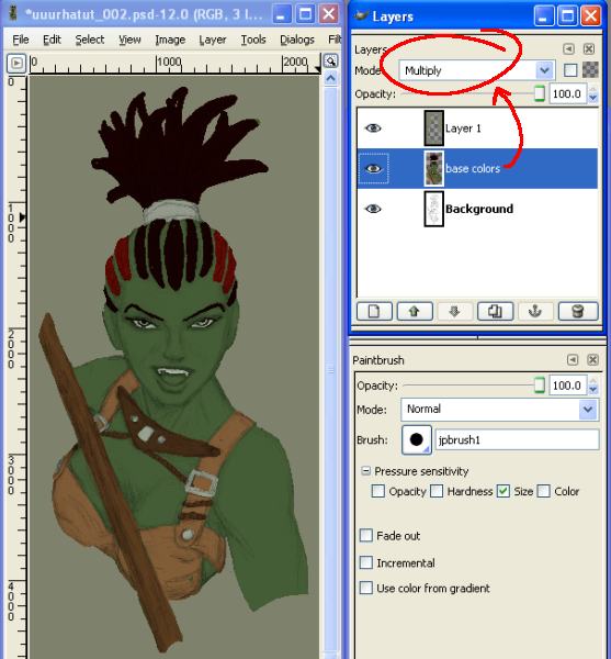
First step is to create a new layer. Then change the Mode of this layer to "Multiply". What this means is that this color adds to the colors below it. In simple terms, it lets you still see your pencil sketch underneath the colors.
Note: Most artists do this in the reverse. They set their inks or pencils on top of the image and set THAT to Multiply. It has the same effect, but it allows you to have multiple color layers. I, however, prefer to use only one color layer for something like this, so I do it this way.
I then make sure my brush is set as follows:
Opacity: 100%
Opacity pressure sensitivity: OFF
Size pressure sensitivity: ON
Theory
This is where I stop and ask myself "what do I have to work with, and what do I want to achieve?". The first part of that question is answered by the characcter itself. Skin color, hair color, clothing color, etc. If I'm drawing someone else's character then they've already told me the nature of the character. That said, I want it to capture the eye as well as be faithful to the character
And that is where "color harmony" comes into play. Better artists than I have written explanations of this, but suffice to say, my first-hand experience is that certain combinations of colors will look better than others.
I lay in the color as cleanly as my patience allows at this stage (and I'm not very patient, so it isn't always that clean). Because I have a tablet, I'm able to press lightly to have a thin brush (for narrow areas) and press hard for wide brush strokes.
After I color the character, I create a third layer on the very top (mode: Normal), and draw in the empty space with a solid color. I use this layer to clip the edges of the character, rather than relying on the color layer to clip it. This also gives me a way to cover any stray pencil mess in the sketch.
Like so:
Warning: Many of the steps from here on are likely to be tricksy if you don't use a tablet, as I take advantage of pressure sensitivity. If you are a patient mouse user, though, you can achieve the same results by manually adjusting opacity/size.
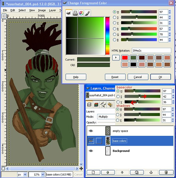
Shadows
First things first: pick your light source. Be it a simple one, or challenging, it is important to choose one and stick with it as much as possible. In this drawing I chose a bright source to the right and in front of her. That would enable me to give her a sense of moving "out of the dark", and also would let me give her face some dramatic shadows (more shadows = more sense of 3-dimensionality).
Ok, so, I open back up the color picker and choose my shadows. The rule I usually follow for shadows is not only darker, but more saturated. In the color picker there are the horizontal sliders labeled H, S, and V. S is for saturation, and I slide this up. V is for value, and I slide this down.
Many people like to put their shadows on a seperate layer. I don't. The way I think and draw it just complicated matters for me. So using my same colors layer, I slapped down shadows with the same brush, still at 100% opacity. This is where you further define the shape. For example, look at her forward arm. I've shaped the shadows to create the impression of muscles that were not indicated in the pencil drawing.
Because I created the "empty space" layer on top of the colors layer, I can color in my shadows without worrying that I'll go outside the line. Anything outside the lines will automatically get clipped.
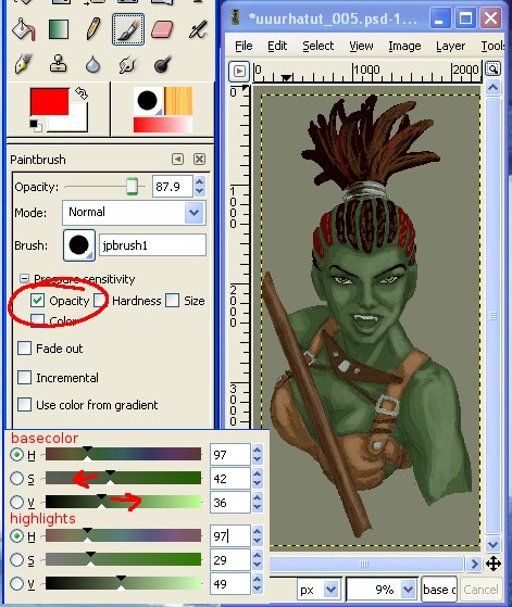
Highlights
For higlights I pick a color that has a higher value and lower saturation. For now I don't change the hue (the H slider). This time I go much lighter than I went dark with the shadows.
The reason for this is that I finally start using a brush that is not 100% opaque. I check the box to vary opacity with pressure, and lower the opacity slider. I personally like to be able to draw both subtle higlights and severe highlights at this point. Some folks don't. Again, this is just how my brain works.
Blend
I do not blend using any tools (such as blur/smudge), but rather by keeping opacity low and going back and forth over the areas I want to have smooth. A good tutorial of how this works (although it uses Photoshop, the principle is the same), can be found here: Color Blending Digitally - by Natascha Roeoesli.
If you have the brush tool available, and you hold down the control key, you will notice that your mouse cursor looks like this:

I use the eyedropper and my brush at low opacity to blend the colors together. When possible I make the sketch layer invisible because it has the tendency to desaturate colors that you pick.
Besides blending the shadows, base color, and highlights, I also change where I put some of the shadows and highlights. I add new hues, such as a very dark blue-green to the shadows of the skin, and a little grin from her skin to the shadows of the tunic. I make the highlights of her skin just a little more green-gold.
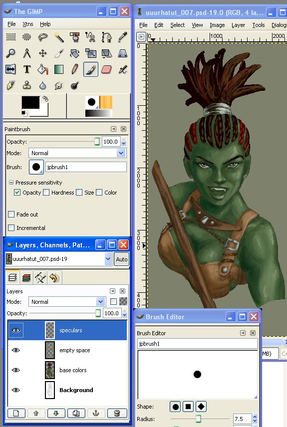
Speculars
Speculars are those spots where the highlights are on steroids. Little "specs" of bright bright light. And they are what gives a lot of life to an image.
So for speculars I created a new layer on the very top, set to normal mode. I changed the brush to 100% opacity and decreased it in size, but left the pressure sensitivity on.
Since this character has very shiny skin, I not only put speculars on her face and metal, but on parts of her arm.
In additional to adding speculars, I used this layer to sharpen up a few details that were poor in the pencil sketch (such as the buckles).
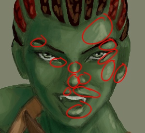
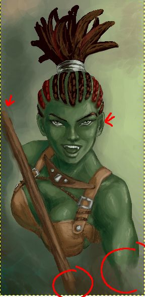
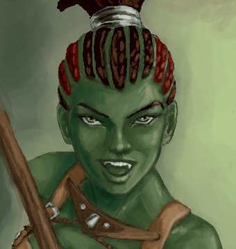
In the image below, I've circled all the areas of the face where I added speculars. (Yes, I know, it's all very messy. I told you this is how I draw my "messy portraits".)
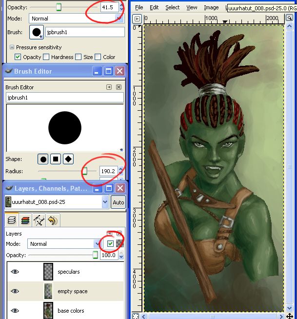
Re-color Background
I don't much care for solid backgrounds and I'm especially fond of shmoo-ey, acid-trip-esque, cloudy ones. So I yank my brush size way up, yank the opacity down, and start color picking and splatting colors around on the "empty space" layer.
Actually, first I check the box (see figure) that locks the transparency. This means that I won't be able to draw in any part of that layer that is currently transparent.
You could, of course, draw in a "real" background instead.
Tweaks
Using the speculars layer, I added some blurry colors at the end of the arm and the ends of the staff to make the transition between image and background more gradual. I also used the smudge took to very lightly go over the edge of the "empty space" layer (I unchecked the lock transparency box first) so that that transition is gentler as well.
I realized that her ears were unformed at this point, so I also added a hint of shape to both ears (much less in the shadowed side, however, since you wouldn't be able to make out as much).
Mirror Trick
Very likely you already know this trick, but if you don't...look at your pictures in reverse. Because almost all of us are left-eyed or right-eyed, and thus our pictures aren't as accurate as we think they are. In the non-digital world this means holding your picture in front of a mirror. In the digital world, this is a little easier.
I use the handy dandy Image->Transform->Flip Horizontally tool to do this
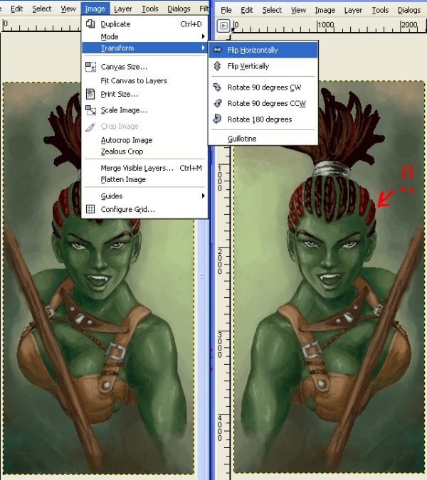
And to my dismay I found that the side of her head in the darkness was bulging rather grotesquely. /sigh Which thusly reminded me I should have flipped the picture muuuch sooner. Don't be like me — do the mirror trick early and often.
Now I have three options of what I can do about the bulge. I can: 1) Leave it. 2) Redraw it. 3) Cheat and warp it. Since I'm a big fat cheater (all digital artists are, didn't you know? ;) ), I choose #3.
Unfortunately this meant I had to flatten the image to one layer and lose my layers, but I was pretty close to done anyways. (Flatten can be found under Image -> Flatten Image.)
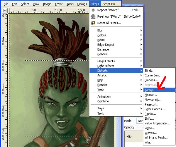
I select a portion of the image (this icon from the toolbar): 
That is because the tool I will be using will not zoom in sufficiently otherwise. By selecting an area of the image, I can ensure a decent sized area to work in.
I then open up the IWarp tool and have fun.
If you look at the figure below, you can see that her head is caved in. I did this to show what IWarp can do (among other things). It warps things. With your cursor. You push things around using the same motions you would to draw. You can produce some freaky results, but with careful application (which involves a bit of trial and error), you can fix things that would otherwise take you hours to patch up.
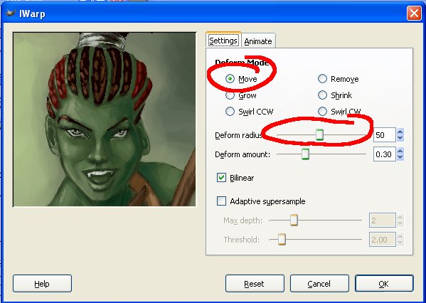
So I happily use the IWarp tool again to drag the eye up a smidgen. Have I mentioned I love this tool? Photoshop has something similar as well known as Liquify. But like with any digital tool, it's best not to get too attached, because you can lose your artistic edge. My goal is to get good enough I never need to use it, but for now, I <3 IWarp.
Final final touches
After that, the last things I did were to use a low-opacity brush to darken the spaces between her braids, as I realized the character was looking almost bald. I also touched up the outline of her right iris, since it wasn't quite looking straight at us anymore, and redefined her other canine so we could see it in all it's pointy glory.
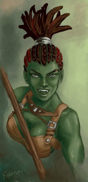
Tada! Done!